Kouman amande koulè a nan ekri an lèt detache logo?
Lè koulè a nan ekri an lèt detache logo pa satisfè kondisyon kliyan an, kisa faktori rad la pral fè?
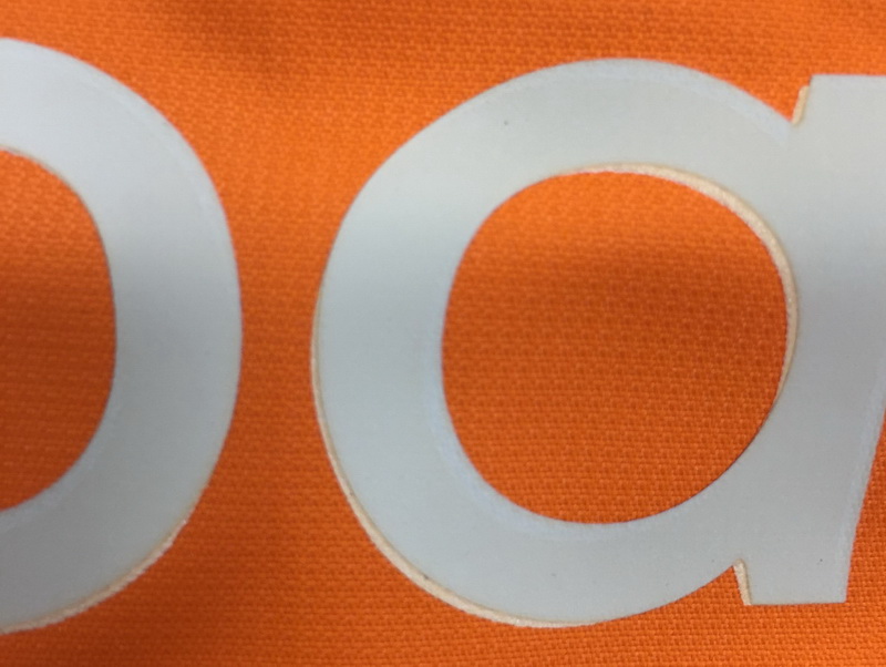
Overlapping logo print
What they try to do is, fè yon logo transfè chalè, mete l 'sou logo la anvan yo, peze l 'ak presyon chalè, Lè sa a, logo la transfere sou twal la sipèpoze yon sèl orijinal la zoranj. Men, mwen te jwenn koulè réimprimer a pa t 'kòrèk encore. Li te blan ak ble, ak sifas la nan logo la enprime parèt yon ti kras diferans, although it is reflective effect. Plis pase sa, The font seems bold than the original one. I am also worried about the colourfastness to wash of the print will be affected. Although the factory says they are still trying to reprint it this way, they can match the colour better and make the font a little bit slim as the original one.
I am not optimistic about this way as the quantity is many. When the worker operates the heat transferring process, the position must be exactly correct. Any tiny movement will make the logo seem worse. And there are 2 logos of them, one on chest and the other on back. Any one of the logo is worse, then the jacket is a defective. So the risk of this operation is big.
Keeping logo print as it is
I have compared them carefully once more, the original print is in good reflective, better than the approved one. Reflective makes shining, in different direction, it appears different colour. My suggestion is, you have good shipment sample as well as bad shipment sample on hand, you can re-evaluate the colour shade variation of logos, considering accept this shipment with some conditions, or persuade the client to accept it.
By the way, one of the possible reasons is, the dyestuff of the fabric transferred to the printing stuff during the solidifying time of print. This happens under some conditions.